

Konec Smart Home:
Systematic UX for a Complex Ecosystem
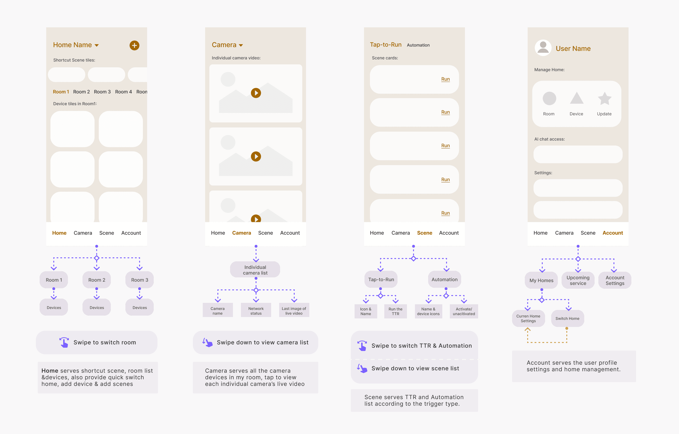
Overview.
How do you deliver a unified, intuitive user experience across a smart home platform that supports dozens of device types and user goals?
In this project, I led the end-to-end UX and UI for the Konec Home app—a cohesive ecosystem across onboarding, navigation, and control surfaces—reducing friction, guiding users with clarity, and enabling confident interaction for both professional installers and everyday homeowners.
Role: Software Design Lead (UX & UI)
Timeline: Mar 2023 – Feb 2024
Platform: iOS, Android
Skill: Research, UX flows, UI system, motion design (Rive.)
Status: ✅ Live in the Konec App
Screen recording from Konec app

tl;dr
Core Challenge:
Smart home platforms often overwhelm new users with fragmented controls, inconsistent device logic, and high cognitive load. Konec needed to support dozens of smart devices—from cameras to lighting to energy hubs—yet still feel simple, scalable, and elegant.
I led the UX and UI design for the entire platform, tackling the end-to-end experience: from first-time onboarding to advanced interaction logic and scalable layout systems. Many users were new to smart homes, so my priority was to make the experience feel smooth, legible, and forgiving—without sacrificing power.
What I did:
• Oversaw UX and UI for the entire platform—including user flows, device panels, navigation, and motion→ Ensured consistency, reduced redundancy, and enabled scalable design evolution
• Led UX research, usability testing, and iterative flows to reduce user confusion and increase system clarity
• Re-architected onboarding and Add Device flows to reduce friction and guide users to successful setup
• Structured the app’s primary navigation and entry points to support clear orientation and efficient access
• Delivered a modular smart switch panel system reused across multiple SKUs—streamlining both user experience and engineering handoff
• Introduced contextual animations (via Rive) to improve learnability and reinforce real-time feedback
✦ Results & Impact:
• First-time setup completion increased by ~30% after redesigning onboarding and Add Device flows
• Fewer customer support tickets related to device pairing and scene setup, according to internal team feedback
• Smart switch panel design reused across 5+ product SKUs—reducing UI design & engineering effort by an estimated 40%
• 8/10 in-field installers rated the setup experience as smooth or intuitive in post-deployment interviews
• Design system and animation patterns now serve as a foundation for future product modules (e.g., energy hub, camera flows)
• The component library and visual rules I established also reduced future design cycles—becoming the foundation for new modules like Energy Hub.
With the big picture defined, here’s how I brought structure, usability, and visual clarity to a highly complex platform.
Designing a Cohesive Ecosystem – From Setup to Control
In a platform with dozens of device types and flows, I focused on building an experience that felt cohesive, usable, and scalable. In each sprint, I used UX demos to validate logic, align the team, and surface usability issues early—accelerating delivery and guiding implementation. These workflows were then brought to life through high-fidelity interaction and motion—ensuring the final experience felt as smooth as it was functional.
This section highlights how I applied this approach across three critical areas: core user flows, navigation, and device control.
01
Core User Flows –
From Entry to Automation
Konec app serves two distinct user groups at different points of the smart home lifecycle:
During installation, on-site technicians (installers) use the app to scan, pair, and configure dozens of devices in rapid sequence.
After handover, homeowners interact with the app to personalise their space—creating Tap-to-runs and Automations to automate daily life.
Add Device – Fast, Reliable Setup for Installers and Homeowners
1.
Multi-device flow chart
UX Analysis – Device Diversity, One Unified Flow
To support dozens of product types and binding protocols, I mapped every possible add-device path into a unified flow model. This unified logic model served both professional installers during initial setup and homeowners who occasionally add or replace devices. It streamlined UX decisions and cross-team alignment.
🧭 UX Demo Validation
To bring ‘Add device’ flow to life, I started with one of the most common device—the smart switch.
🎥 Live App Demo
Let’s take a switch as an example—one of the most frequently installed products—to walk through this unified flow from logic to live implementation. This feature helped reduce setup confusion and improved handoff efficiency for installers.
2.
Create Scene –
Intuitive Customisation for Residents
User Insight – Real Journeys Behind Scene Creation
To ensure the scene creation flow matched real-life needs, I began with deep research into how users interact with smart devices across different times and spaces. By analysing routines and expectations across participants, I identified common triggers, pain points, and opportunities for guidance.
Journaling insight board
🧭 UX Demo Validation
For this example, I use “Movie time” to demonstrate creating a ‘Tap-to-Run’ including 2 light groups and 1 delay timer. The flow was designed to work even for users with no technical background.
🎥 Live App Demo
Here’s how the final Tap-to-Run scene performs in the live app—connected to real smart devices.
Once users are in the system, how do they stay oriented?
This section shows how I structured top-level pages and navigation to support clarity, speed, and scale.
Top-Level Navigation –
Designing for Orientation and Entry
02
Smart home apps often confuse users with unclear structure and fragmented modules. I designed a clear top-level structure across Home, Scene, Camera, and Account—each with its own user intent and navigation logic.
The Challenge
UX Architecture – Page Roles, Routes & Hierarchy
🧭 UX Demo Validation
I created a 'Top-level Navigation' prototype to explore tab interaction, content rhythm, and visual scanning across pages. This prototype helped align structure and interaction expectations with stakeholders before UI stage.
• Bottom tab bar for fast switching across product modules
• Swipeable homepage interface to change rooms effortlessly
• Prominent shortcut scenes placed above room controls for one-tap actions
Key interactions demonstrated:
Building on the UX prototype, the final product fully delivers the intended tab logic and scanning rhythm. Final app walkthrough—showing how users navigate core modules with clarity and consistency across daily routines.
🎥 Live App Demo
Live Konec app record
✦
Quick room switching and scene access from the top of the Home page allow users to move fluidly between spaces—especially useful for households with large numbers of devices.
But smart home control isn’t just logical—it has to feel fluid.
I designed a modular device panel system to handle dozens of switch variations with visual clarity and responsive motion.
Among the most challenging device interface designs was the smart switch.
There are four type of smart switch: 1-Gang Switch, 2-Gang Switch, 3-Gang Switch and 4-Gang Switch. Each gang may or may not be bound to a colour or white lighting group.
The Challenge
System Thinking in Motion – Designing the Switch Panel
03
To streamline logic and UI reuse, I modeled each gang position as a modular card—visually encoding its binding state, lighting capability, and control affordances.
Interaction Model – Visualising Gang States as Modular Cards
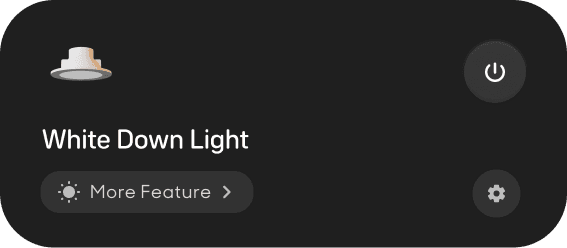
Card 1: Gang without light
• Switch icon
• Gang name
• Tap-to-toggle (on/off)
Settings
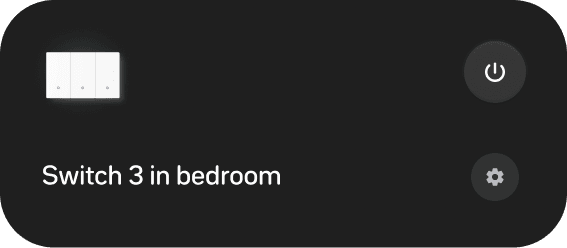
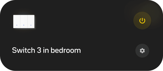
Gang without lights
Card 2: Gang with colour light
• Colour light icon with responsive visualisation to show On/Off status
• Gang name
• Tap-to-toggle (on/off)
• Access to adjust brightness&colour
Settings
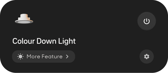
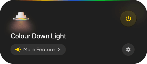
Gang with colour lights
Card 3: Gang with white light
• White light icon with responsive visualisation to show On/Off status
• Gang name
• Tap-to-toggle (on/off)
• Access to adjust brightness&colour
• Settings
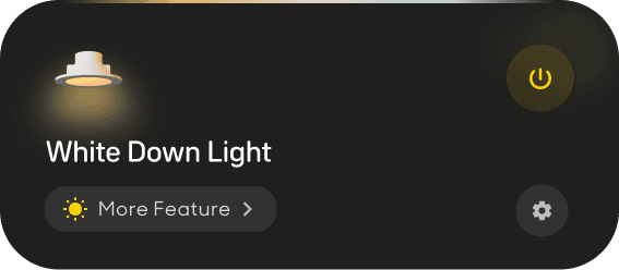
Gang with white lights
↓
These states later mapped directly into the Rive animation logic via three input variables—gang count, binding status, and lighting type.
I created two inputs—Number and Boolean to allocate specific gang state.
Set ‘Default/Off’ as a default state to allocate On / Off
Number 1 represents gang without lights
Number 2 represents gang with colour lights
Number 3 represents gang with white lights
Checked ‘Default/Off’ represents ‘Turn off’
Unchecked ‘Default/Off’ represents ‘Turn On’
✦ Value & Impact
I’m not only designing the interactive visual function, but also bring this function to product life—the Rive animation package can be embed into program directly, we bypassed implementation effort and preserved motion consistency across SKUs.
This solution covered 98% of real-world states—turning complex device logic into a responsive, elegant user experience.
Default/Off
Number
1
]
[
]
[
input
Change gang number & state to preview animations
To bring this design to product life, I use Rive to accomplish the core interactive function - turn on/off, creating a modular animation system.
Animation package — Built in Rive
The panel dynamically adjusts based on gang count and device bindings—ensuring consistency and scalability across SKUs.
Finally, I combined different cards to present the full range of 1-4 gang switch panels using this Rive-based animation system.
Final UI Interaction –
Unified Logic Across All Product Variants
• Every gang-card with
• A global “All On/Off” button—quick batch control
• Seamless transitions and shared Rive logic
Every panel includes:
4-Gang Switch
3-Gang Switch
2-Gang Switch
1-Gang Switch
Ready to see it power real devices?
Here’s how the same system performs in the wild.

Behind every smooth interaction is a solid foundation.
Here’s how I defined the UI system that brought consistency and scalability to the entire Konec platform.
Design System Foundations –
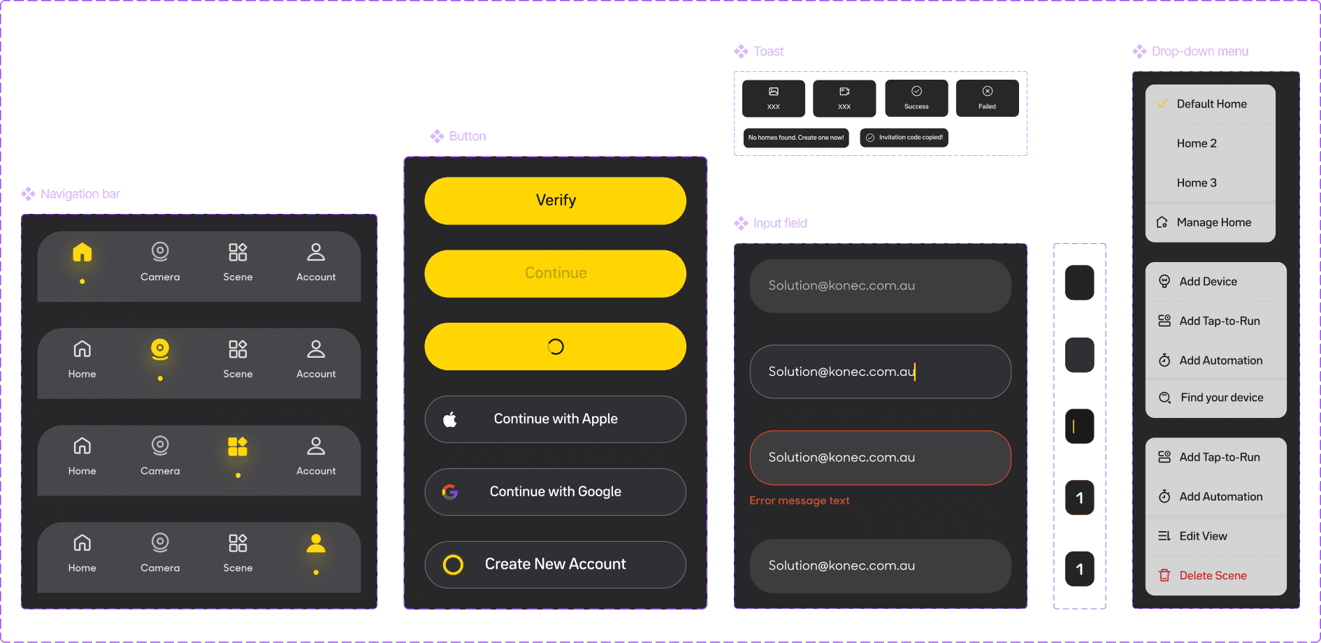
Ensuring Scalable, Predictable Interfaces
• Buttons (primary / secondary / disabled / loading)
• Inputs (text fields, focus states)
• Card layouts, toggles, modals, alerts
• Responsive containers, layout spacing
• Motion tokens and dark/light mode consistency
What I Built
A flexible UI component library used across 20+ flows:
• Reduced QA feedback cycles by standardizing error + loading states across 10+ modules
• Enabled 40% faster design-to-dev handoff using tokenized motion & layout structure
• Built a foundation reused in new product launches (Energy, Multi-Camera, HEMS)
✦ Value & Impact
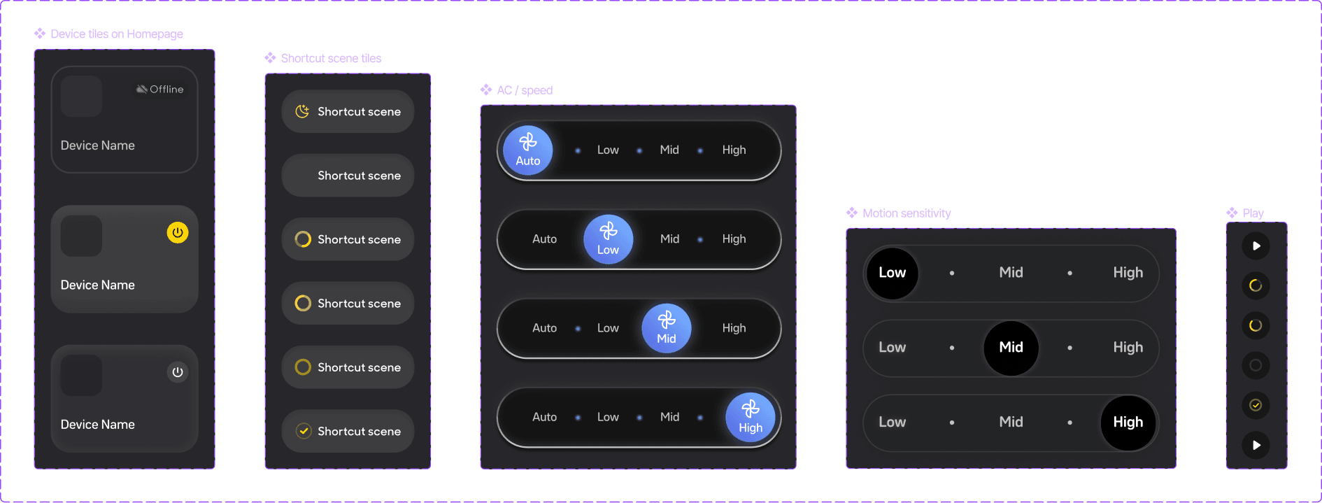
Snapshots – Core UI & Motion Tokens
Motion Token
Defined for common transitions like toggle, scene run, AC speed, and sensitivity—ensuring consistent animation logic across different devices.
Reflection
This project wasn’t just about building a system—it was about shaping a product that feels approachable, scalable, and empowering.
I constantly asked: “Will new users understand this flow? Will experienced users find it efficient?” I focused on reducing friction and clarifying structure, helping users navigate a complex product with confidence. I also played a key role in driving team alignment: by introducing UX demos early in each sprint, I helped PMs and engineers clarify logic, catch edge cases, and reduce rework.
Today, the Konec app supports dozens of smart devices across diverse user needs—built on a solid foundation, and designed to grow.